
Startup - Go to Market
Client
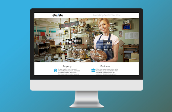
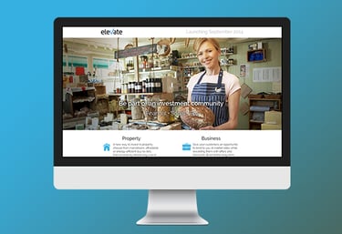
Elevate Capital (now Elevate Invest) developed technology to unlock property as an asset, by making it tradable and more liquid using a peer-to-peer platform
Elevate Fintech Web App
My Role
Lead IA/UX Designer
Skills
Ethnographic Research, Gathering Requirements, Wireframes, Prototyping, Interaction Design, Interface Design, Presenting to Stakeholders, User Testing, Organising Workshops, Leading Design
Overview
Elevate Capital is a peer-to-peer platform for investors to build portfolios of properties and privately-owned businesses. An in-house team was tasked with developing the platform based on a working prototype used to secured venture capital investment.
Challenge
The platform had been built to seek funding, the initial design concentrated mostly on feature set rather than experience. It was very difficult to navigate or to understand what actions to carry out. The team was tasked with revamping the existing platform into a desktop based web application, with the end - user's experience as the focus.
Research & Analysis
User research focuses on understanding user behaviors, needs, and motivations through observation techniques, task analysis, and other feedback methodologies. For me user research is “the process of understanding the impact of design on an audience”.
Discovery
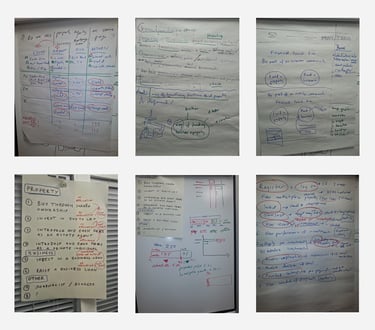
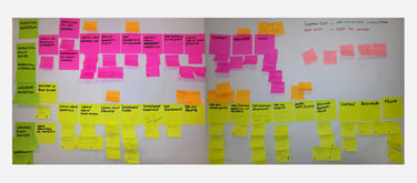
Coordinated several workshops with stakeholders so we could breakdown the product to its component parts. This helped the team establish business goals and manage expectations as to what could be delivered for the MVP. This also clarified what the product was and/or was not.
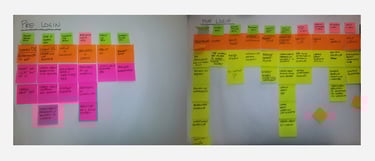
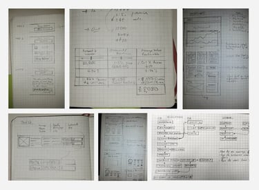
Discovery Workshop Output

User Testing
We had access to some early adopters and investors who we had use the site in the Elevate office as well as remotely over skype. We handed them some tasks and recorded their interaction on screen.
Competitor Analysis
The industry was young when we were started the project especially in the UK but we still had access to a handful of competitors to see what was already in the marketplace but also watch out for gaps we could improve on.
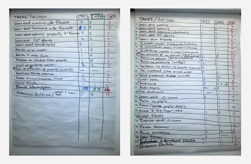
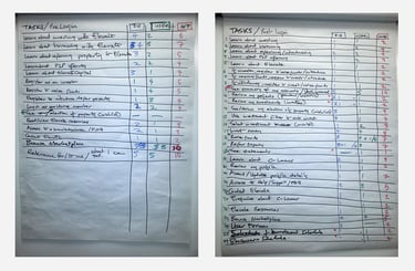
Defining user tasks
Identify and aligning tasks along common paths and establishing journeys. This was done in a workshop that consisted of users and the business. Each group ranks tasks with a value. This helps trim the scope to suit MVP.
Other Research Methods
After the discovery a few patterns began to emerge
Initial Findings
User found navigation was confusing.
Users found information on the page seemed complicated and sometimes contradicting.
They found no distinction between a ‘call to action’ and input field.
Users did not know how to carry out or complete a transaction.
The platform did not meet the minimum login security for a financial platform.
This led us (myself - lead UX, and head of development - Julius Pabrinkis) to revise the initial brief with the business founder Paul Toon. We recommended an MVP rather than the full application. this would achieve 2 main benefits -
Go to market with in 6 months (the initial requirement was not achievable with that time frame).
Validate what the user needs vs what the business thinks the user needs.
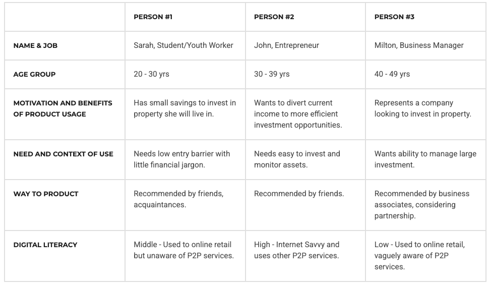
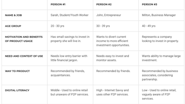
Personas
With common scenario’s in place, we were able to define detailed personas, using their vast data pool. The personas looked something like this:
Proposed Solution
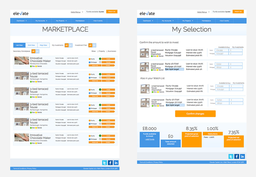
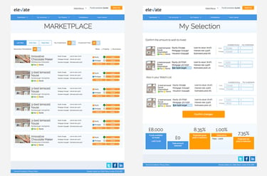
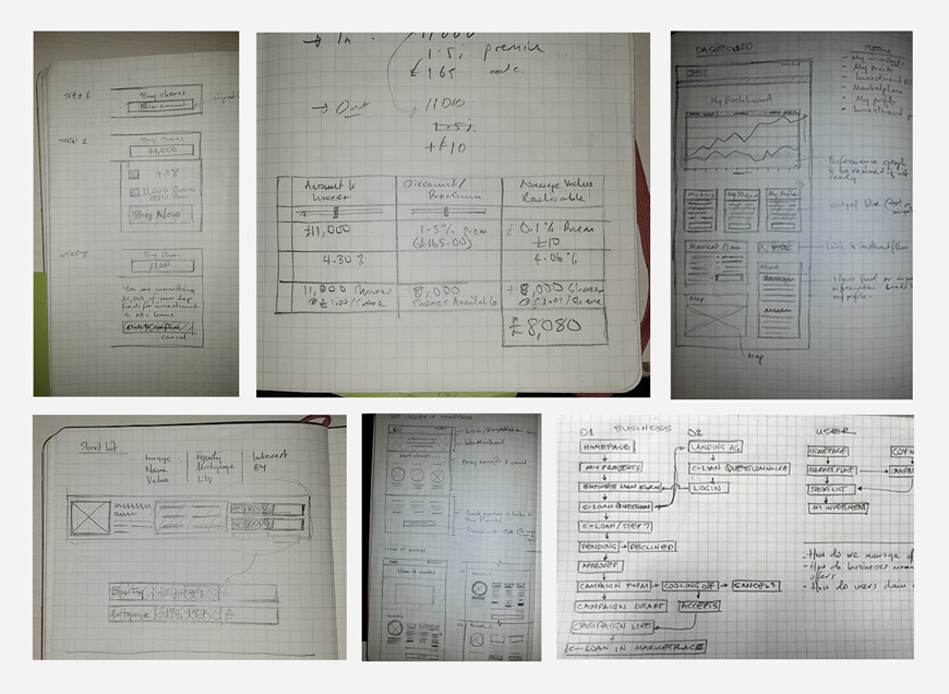
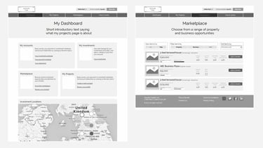
With the proper planning, we were able to confidently move into creating wireframes for the app. We took the decision to focus more on the functionality and structure of the app, opting for low-fidelity wireframes with very little detail. Ultimately, we could add design elements in later, what was important for our users, was that the product (above all) was clear and simple.
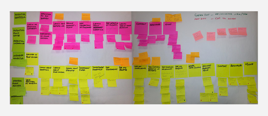
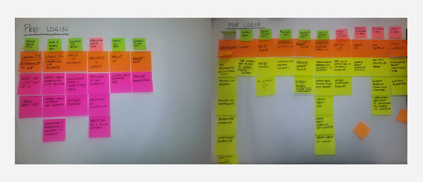
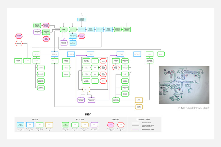
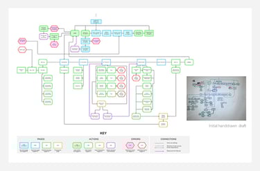
Defining user Journeys
Rough Ideas
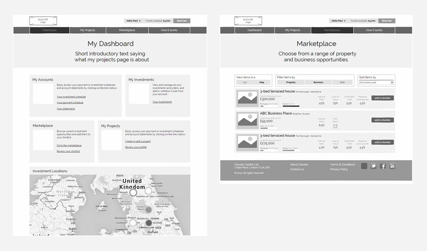
Prototype

Working Prototype
Rapid prototyping allowed us to present complex financial ideas to users and instantly get instant feedback, which in turn enabled quick iteration without tying down valuable development resource.
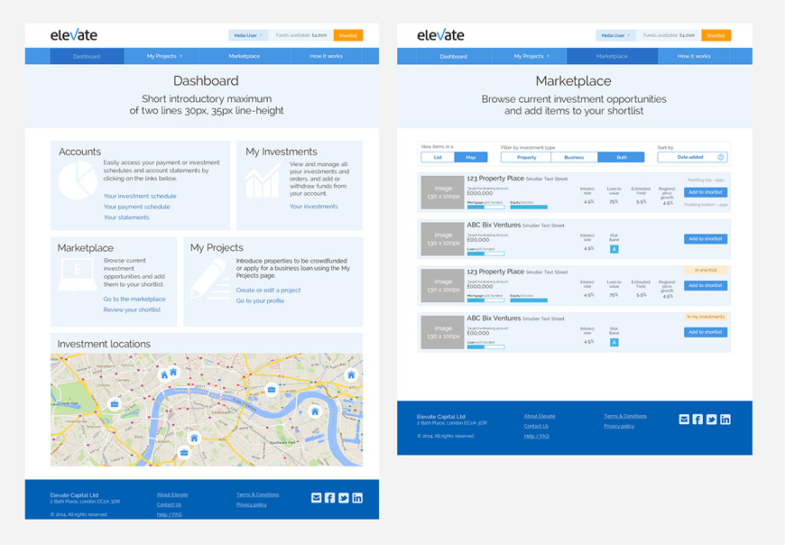
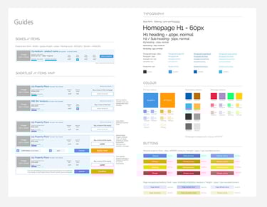
Style guide

After multiple reiteration and testing with user we achieved -
Outcome
We helped the business clarity it's offering to the user.
Simplified the layout and content of the platform aid user expectation.
Improved booking process to guide user along.
MVP went into development on time.
CEO Feedback
Kayode produced some great design work for us, coming up with a lot of creative solutions for products and concepts which involved a fair amount of complexity. He was very focused and systematic in his approach, ensuring consistency across the site, delivering a nice clean look that got good feedback from third parties. His great sense of humour helped get us through many a tight deadline – a great addition to the team.
Paul Toon, CEO Elevate Capital.
Kayode Olorunfemi
Research + Strategy + Design
CV / Resume
© 2025. All rights reserved.